CPRS’s New User Interface
— You do not need to take any action. The CPRS link is the same.
— You don’t need to change your userID or your password.
— There are NO changes to the workflow or the features.
— You’ll see a cleaner, more consistent user interface.
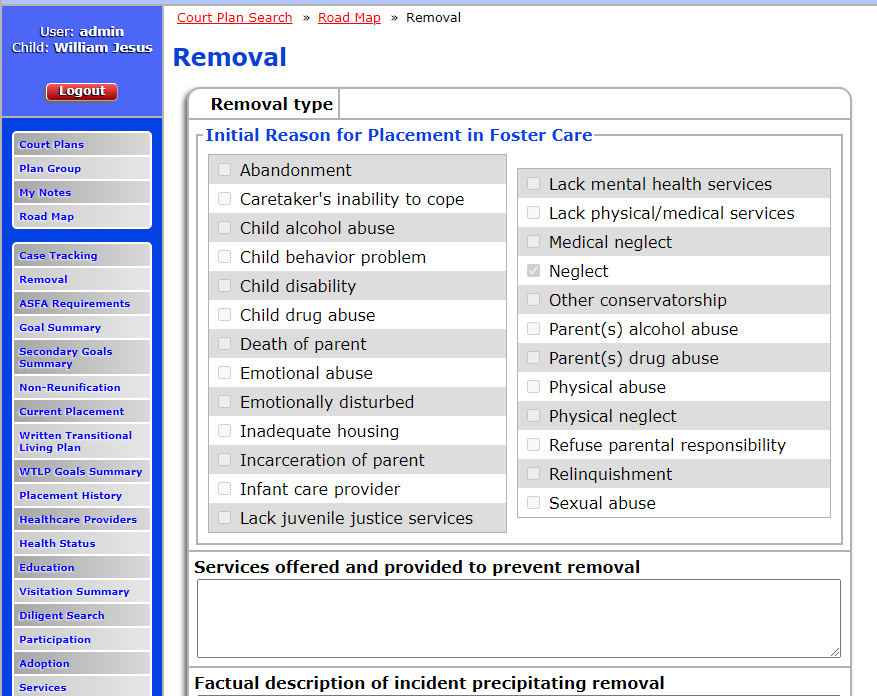
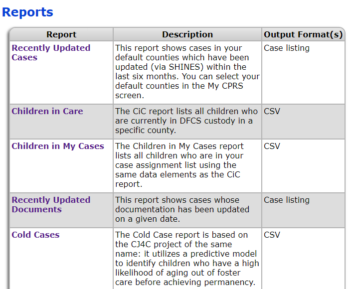
One of the visual changes you’re likely to first notice is the rounded corners. Virtually all tables and buttons in CPRS2 now have rounded corners, which helps give them a sleeker, more modern look. Many tables also make use of background gradients to the same effect.
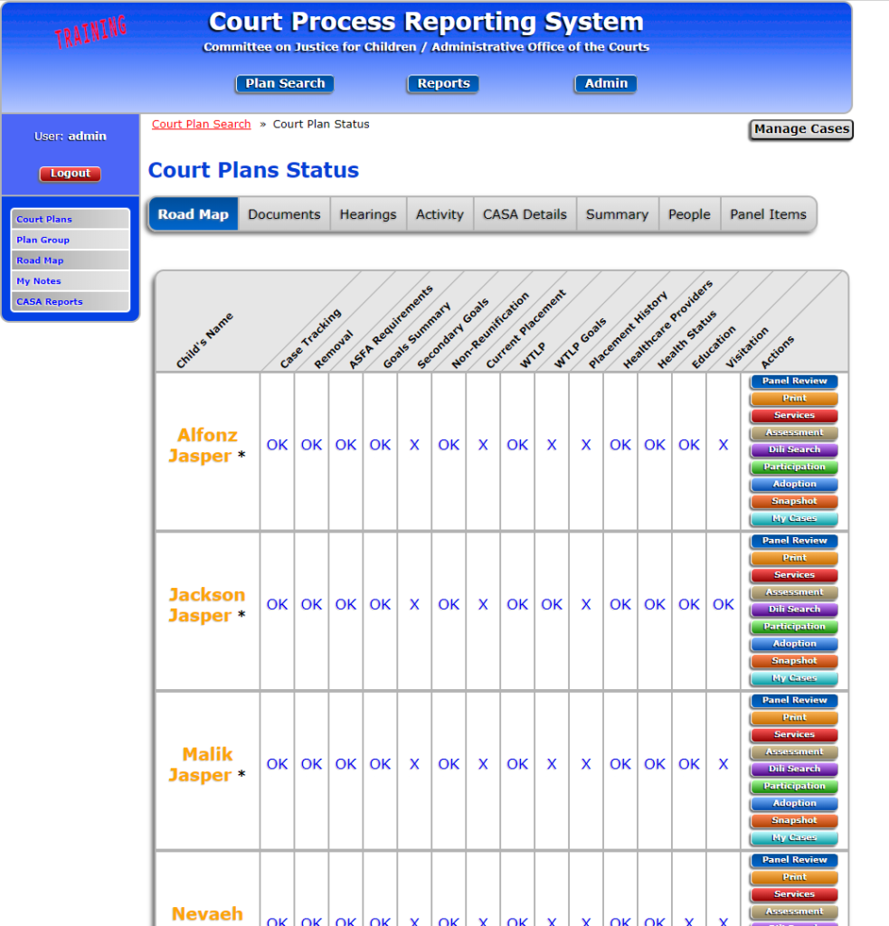
Another key visual change throughout the application is the updated look for most buttons and links. When certain buttons (e.g., View buttons) are clicked, their outlines will turn pink going forward (as opposed to the text itself turning from blue to purple).

Several tables have undergone layout changes so that they have four columns instead of just two. Fields should generally still be in the same order – we’ve just altered the layout to save some vertical screen space (which should save you some scrolling). You should generally still be able to use the tab key to move through the prompts in the same order you used to.
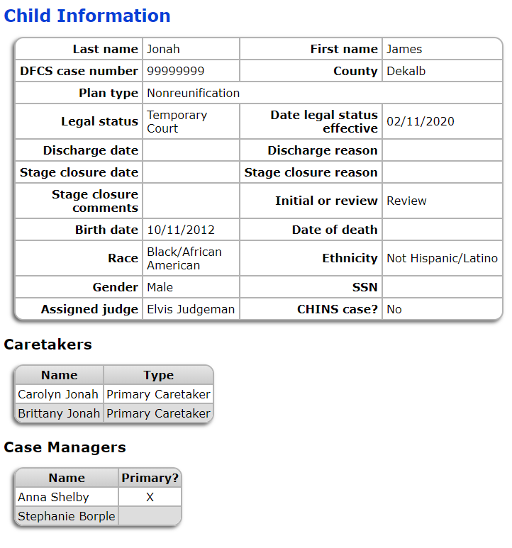
One update with some practical utility is that many tables now display with alternating row colors. These tables are usually ones that display search results or other lists, so the alternating row colors should help make them easier to read.
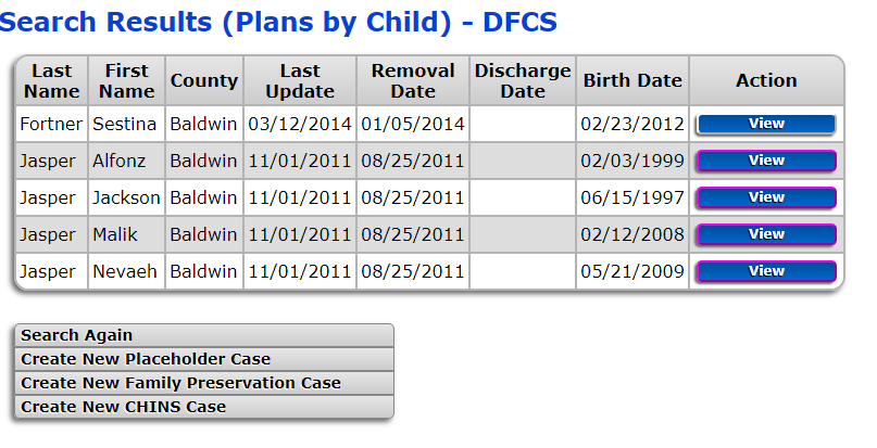
Another update worth noting is that a lot of “floating” text and links have been incorporated into organized tables, hopefully making the pages more consistent and intuitive.
A final change you may notice is that we’ve applied new capitalization and grammar rules across the entire application to make things look more consistent and polished. None of the content should have seriously changed, and all the information you need will still be in the same places.
